Dashboards Don’t Drive Decisions – Gethyn Ellis
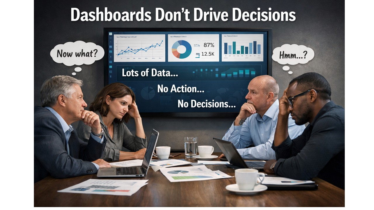
They’re not short of dashboards. They’re not short of data. They’re not even short of beautifully designed Power BI reports. Yet the same conversations keep happening. The same issues resurface month after month. And the same decisions get deferred, diluted, or quietly ignored.
If that sounds familiar, it’s not because your data is wrong. It’s because your dashboards stop at information.
The familiar meeting that goes nowhere
You’ve probably seen this play out.
A dashboard goes up on the screen. People nod.
Someone asks a sensible question.
Someone else offers an interpretation.
A third person disagrees.
And then the meeting ends.
- No decision.
- No clear action.
- No change in direction.
The dashboard did its job, technically speaking. It showed the data. The numbers were accurate. The visuals were clear. But nothing happened next.
This is the uncomfortable truth: showing information is not the same as enabling a decision.
Why dashboards feel useful but change very little
Most dashboards are built with good intentions. They’re designed to be comprehensive, neutral, and flexible. They show performance from multiple angles. They let the audience explore and “draw their own conclusions”. That sounds sensible.
In reality, it’s where things break down.
Humans don’t make decisions from charts. They make decisions from understanding. And understanding doesn’t come from being presented with options and hoping meaning will emerge. It comes from context, narrative, and relevance to a specific choice that needs to be made.
When a dashboard presents ten charts of equal importance, it silently asks the audience to do the hardest work themselves:
- What matters most?
- What should I focus on?
- What does this mean for the decision I’m responsible for?
Different people answer those questions differently. That’s why dashboards often create debate rather than direction.
“Interesting” is not a success metric
One of the most dangerous words in analytics is interesting.
If someone looks at a dashboard and says, “That’s interesting,” what they usually mean is:
- I can see patterns
- I’m not sure what they imply
- I don’t yet know what to do
An interesting dashboard might get attention. It might even get praise. But if it leaves the audience thinking “Hmm…” instead of “Here’s what we need to do”, it has failed its most important job.
A successful analytics product doesn’t just inform. It reduces uncertainty at the moment a decision needs to be made.
The missing ingredient: decision intent
The real issue isn’t visualisation. Its intent.
Most dashboards are built by starting with the data:
- What tables do we have?
- What measures can we calculate?
- What breakdowns might be useful?
Decision-driven analytics starts somewhere else entirely:
- What decision is currently blocked?
- Who owns that decision?
- What would change if we had clarity?
When you start with the decision, everything else sharpens:
- Fewer metrics matter.
- Visuals become explanatory, not exploratory.
- The report develops a point of view.
This doesn’t mean manipulating the data or hiding nuance. It means accepting responsibility for guiding the audience, rather than outsourcing interpretation to them.
Why better dashboards aren’t the answer
When organisations realise their dashboards aren’t driving action, the usual response is to build more of them. Or rebuild them. Or redesign them.
But without a shift in thinking, you just end up with nicer dashboards that still don’t lead anywhere.
The constraint is not Power BI. It’s not DAX. It’s not modelling. The constraint is that most teams have never been taught how to design analytics around decisions, rather than around data structures.
From dashboards to decision tools
This is exactly the gap the Data Accelerator is designed to address.
The Accelerator isn’t about teaching people how to build more reports. It’s about changing how analytics work gets framed in the first place:
- starting with real business decisions
- designing reports with a clear beginning, middle, and end
- reducing cognitive load rather than adding visual complexity
- turning Power BI outputs into tools that actually influence behaviour
When teams adopt this approach, something interesting happens.
Meetings change. Conversations move faster. Decisions become clearer.
Not because the data is different, but because the analytics finally lead somewhere.
A simple test for your last dashboard
If you want to pressure-test your own work, try this:
- What decision was it designed to support?
- What action should follow from it?
- Would two different stakeholders reach the same conclusion?
If those answers aren’t obvious, the dashboard isn’t finished yet.
Dashboards don’t drive decisions.
But decision-driven analytics does, when it’s designed that way on purpose.
Next in this series, I’ll dig into why “more data” often makes decision-making worse, and how to design analytics that work with the human brain rather than against it. If you to come and see me talk about this at the Birmingham Power BI User group on 4th March, you can signup here�
News
Berita Teknologi
Berita Olahraga
Sports news
sports
Motivation
football prediction
technology
Berita Technologi
Berita Terkini
Tempat Wisata
News Flash
Football
Gaming
Game News
Gamers
Jasa Artikel
Jasa Backlink
Agen234
Agen234
Agen234
Resep
Cek Ongkir Cargo
Download Film

Moneyball Fantasy Premier League Power BI: Data-Driven FPL Decisions from My Madrid Talk
Moneyball in Madrid: Data, Decisions, and a Weekend of FPL Analytics
I’ve spent the weekend in Madrid delivering my talk “Moneyball: Building a Killer Fantasy Football Team with Power BI.”It was a brilliant event, and despite my session being in English, the turnout was fantastic. A big thank you to everyone who came along, engaged with the content, and stayed behind afterwards to ask questions. Events like this remind me why I love blending data, football, and teaching.
One question stood out above the rest. Joaquín González Galdo LinkedIn profile asked:
“What is the key metric you use when making decisions in FPL?”
It’s a deceptively simple question, yet powerful. Choosing a single metric to define your decision-making process is something every analyst and FPL manager wrestles with. It deserves a full blog post of its own, and it’s the kind of question I’ll be bringing to the next episode of the Power BI FPL Show with Ben Ferry and Justin Bird. There’s a lot to unpack, from expected points to form trends, fixture difficulty, and effective ownership. Watch this space for a deeper dive.
Power BI File and API Scripts Now Available
During the session, I promised to make my Power BI file available, along with the PowerShell script I used to connect to the FPL API and pull individual player gameweek data. I’ve now uploaded everything to my GitHub hub repo, and you can access it here:
Feel free to explore, clone, modify, and test the model. The Power BI report demonstrates how to build a star-schema model for FPL, how to perform gameweek-level analysis, and how to apply metrics and calculations that help drive decision-making. The PowerShell connector script is lightweight but effective, making it a useful starting point for anyone wanting to extend their own FPL-powered data pipelines.
When Your Internet Fails and You Panic-Transfer Your Keeper
Ironically, just as I was demonstrating the value of data-driven decisions, the venue Wi-Fi failed—leaving me
unable to update my own team live during the talk. Classic.
Once I returned to a stable connection, the first move I made was in goal: Roefs out, Henderson in.
Henderson’s estimated points came in at around 7, compared with Roefs at 2.7, making the swap a straightforward one under my evaluation framework. Even small improvements at the goalkeeper position can meaningfully shift weekly variance, so this one was a no-brainer.
Semenyo vs Grealish – A Tale of Two Underperformers
I’m still torn on whether to transfer out Semenyo. His numbers and projected points definitely suggest that he should go—yet selling him would mean losing team value. Value preservation is a key element of long-term strategy, so for now he survives.
Grealish, however, hasn’t been pulling his weight either, and unlike Semenyo, I’m not emotionally invested in holding him. His form has dipped, and Everton have been erratic.
So I made the switch: Grealish → Harvey Barnes (Newcastle United)
Barnes has been sharp, has strong underlying metrics, and a very favourable run of fixtures. There’s also some interesting off-the-pitch chatter about him potentially switching international allegiance to Scotland following their World Cup qualification, nothing like a burst of motivation to keep his form trending upward.
Woltemade Out – But Who Comes In?
The next move was shipping out Nick Woltemade. West Ham’s Callum Wilson is in form, and although the fixture against Liverpool looks challenging on paper, the FDR simply isn’t capturing how poor Liverpool have been defensively. There’s a part of me that thinks Wilson could genuinely haul. He’s clinical, he’s confident, and he loves a headline moment.
The alternative I’m considering is Igor Thiago from Brentford. He’s less injury-prone than Wilson, he’s been ticking along nicely, and the fixtures are much kinder. His underlying numbers put him firmly in the “viable punt” category. I may still pivot before the deadline.
I chose Thiago.
When Gut Instinct Creeps Back In
One thing I admitted during the session: over the past few weeks, I let my gut start to override my framework. With Manchester City’s tough run of matches, I tried to be clever and avoid captaining Haaland. It hasn’t paid off. This week, the data actually suggested that Harvey Barnes could be a viable captaincy option. His estimated points placed him right in the conversation. But there’s one metric that trumps everything: effective ownership. Haaland’s remains huge. If he hauls—and he’s due—going without him as captain would be catastrophic.
So, despite Barnes being a legitimate option under the model, I’ve done the sensible thing: Haaland is back as captain.Here’s my final lineup
A good reminder that data-driven decision-making is a discipline. It requires consistency.
Final Thoughts
Madrid was superb. Great city, great people, great conversations, and a great reminder of how global the FPL and Power BI communities have become. I’ll be writing more about key metrics, decision frameworks, and how to build your own analytics workflow for Fantasy Premier League.
Until then, enjoy the files, enjoy the data, and good luck for the gameweek ahead.
Useful Links
Exploring Microsoft Fabric Through Fantasy Premier League Data
The Cost of Doing Nothing: How Ignoring Data Strategy Drains SME Growth
How to Win at Fantasy Premier League Using Data Analytics and Power BI
News
Berita Teknologi
Berita Olahraga
Sports news
sports
Motivation
football prediction
technology
Berita Technologi
Berita Terkini
Tempat Wisata
News Flash
Football
Gaming
Game News
Gamers
Jasa Artikel
Jasa Backlink
Agen234
Agen234
Agen234
Resep
Cek Ongkir Cargo
Download Film