Dashboards Don’t Drive Decisions – Gethyn Ellis
They’re not short of dashboards. They’re not short of data. They’re not even short of beautifully designed Power BI reports. Yet the same conversations keep happening. The same issues resurface month after month. And the same decisions get deferred, diluted, or quietly ignored.
If that sounds familiar, it’s not because your data is wrong. It’s because your dashboards stop at information.
The familiar meeting that goes nowhere
You’ve probably seen this play out.
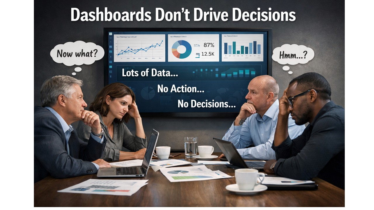
A dashboard goes up on the screen. People nod.
Someone asks a sensible question.
Someone else offers an interpretation.
A third person disagrees.
And then the meeting ends.
- No decision.
- No clear action.
- No change in direction.
The dashboard did its job, technically speaking. It showed the data. The numbers were accurate. The visuals were clear. But nothing happened next.
This is the uncomfortable truth: showing information is not the same as enabling a decision.
Why dashboards feel useful but change very little
Most dashboards are built with good intentions. They’re designed to be comprehensive, neutral, and flexible. They show performance from multiple angles. They let the audience explore and “draw their own conclusions”. That sounds sensible.
In reality, it’s where things break down.
Humans don’t make decisions from charts. They make decisions from understanding. And understanding doesn’t come from being presented with options and hoping meaning will emerge. It comes from context, narrative, and relevance to a specific choice that needs to be made.
When a dashboard presents ten charts of equal importance, it silently asks the audience to do the hardest work themselves:
- What matters most?
- What should I focus on?
- What does this mean for the decision I’m responsible for?
Different people answer those questions differently. That’s why dashboards often create debate rather than direction.
“Interesting” is not a success metric
One of the most dangerous words in analytics is interesting.
If someone looks at a dashboard and says, “That’s interesting,” what they usually mean is:
- I can see patterns
- I’m not sure what they imply
- I don’t yet know what to do
An interesting dashboard might get attention. It might even get praise. But if it leaves the audience thinking “Hmm…” instead of “Here’s what we need to do”, it has failed its most important job.
A successful analytics product doesn’t just inform. It reduces uncertainty at the moment a decision needs to be made.
The missing ingredient: decision intent
The real issue isn’t visualisation. Its intent.
Most dashboards are built by starting with the data:
- What tables do we have?
- What measures can we calculate?
- What breakdowns might be useful?
Decision-driven analytics starts somewhere else entirely:
- What decision is currently blocked?
- Who owns that decision?
- What would change if we had clarity?
When you start with the decision, everything else sharpens:
- Fewer metrics matter.
- Visuals become explanatory, not exploratory.
- The report develops a point of view.
This doesn’t mean manipulating the data or hiding nuance. It means accepting responsibility for guiding the audience, rather than outsourcing interpretation to them.
Why better dashboards aren’t the answer
When organisations realise their dashboards aren’t driving action, the usual response is to build more of them. Or rebuild them. Or redesign them.
But without a shift in thinking, you just end up with nicer dashboards that still don’t lead anywhere.
The constraint is not Power BI. It’s not DAX. It’s not modelling. The constraint is that most teams have never been taught how to design analytics around decisions, rather than around data structures.
From dashboards to decision tools
This is exactly the gap the Data Accelerator is designed to address.
The Accelerator isn’t about teaching people how to build more reports. It’s about changing how analytics work gets framed in the first place:
- starting with real business decisions
- designing reports with a clear beginning, middle, and end
- reducing cognitive load rather than adding visual complexity
- turning Power BI outputs into tools that actually influence behaviour
When teams adopt this approach, something interesting happens.
Meetings change. Conversations move faster. Decisions become clearer.
Not because the data is different, but because the analytics finally lead somewhere.
A simple test for your last dashboard
If you want to pressure-test your own work, try this:
- What decision was it designed to support?
- What action should follow from it?
- Would two different stakeholders reach the same conclusion?
If those answers aren’t obvious, the dashboard isn’t finished yet.
Dashboards don’t drive decisions.
But decision-driven analytics does, when it’s designed that way on purpose.
Next in this series, I’ll dig into why “more data” often makes decision-making worse, and how to design analytics that work with the human brain rather than against it. If you to come and see me talk about this at the Birmingham Power BI User group on 4th March, you can signup here�
News
Berita Teknologi
Berita Olahraga
Sports news
sports
Motivation
football prediction
technology
Berita Technologi
Berita Terkini
Tempat Wisata
News Flash
Football
Gaming
Game News
Gamers
Jasa Artikel
Jasa Backlink
Agen234
Agen234
Agen234
Resep
Cek Ongkir Cargo
Download Film

Understanding Slowly Changing Dimensions – Gethyn Ellis
Understanding Slowly Changing Dimensions
Slowly Changing Dimensions (SCDs) are a cornerstone of data warehousing design. They ensure that the descriptive attributes of business entities—customers, products, employees, locations—are handled correctly when they change over time. Without a clear strategy for tracking changes in dimension data, analytical systems either lose valuable history or become inconsistent, leading to inaccurate reporting.
In this post, we explore the major SCD types, what they mean in practice, and how they fit into a typical dimension-loading routine. We also take a closer look at the most commonly used approach: the Type 2 Slowly Changing Dimension.
What Are Slowly Changing Dimensions?
A dimension becomes “slowly changing” when its attributes do not remain static. Customer names change, product descriptions evolve, and organisation structures shift. A data warehouse needs a strategy for handling these changes in a predictable, auditable manner.
The most recognised SCD types include:
- Type 0: Fixed — no changes allowed A Type 0 dimension attribute is effectively read-only. Once loaded, it never changes. This is useful for values that should remain permanently tied to the original record, such as a customer’s join date or the original product launch category.
- Type 1: Overwrite — no history Type 1 simply overwrites old values with new ones. The historical value is lost. This approach is suitable for correcting errors or updating non-critical attributes such as a standardised name format.
- Type 2: Add a new record — full history preserved Type 2 is the workhorse of dimensional modelling. Each time a change occurs, a new version of the record is inserted, and the old version is closed off using effective dates. This preserves a complete history of how the entity evolved over time.
- Type 3: Add a new column — limited history Here, the old value is stored in an additional “previous value” column. This gives only a snapshot of one historical state. It is useful when you only need to compare “current” versus “prior” attributes.
- Type 4: History table — archive old records Older versions are moved into a dedicated history table. The current table stays small and fast, while detailed historical records remain accessible when required.
- Type 5/6: Hybrid approaches Large or complex organisations sometimes blend techniques, such as combining Type 1 and Type 2 behaviours for different sets of attributes, or maintaining both current and historical versions for performance reasons.
Why Type 2 Is the Most Common
Most real-world data warehouses favour Type 2 SCDs, particularly for customer, product, and employee dimensions. Businesses need to analyse behaviour and performance based on what was true at the time, not what is true today. For example:
- What product category did this item belong to when the sale was made?
- What address was the customer living at when the invoice was issued?
- Which department was the employee assigned to when the project started?
Type 2 SCDs allow reports to reflect the correct historical context by storing every version of the record along with a validity range.
A Typical Type 2 Loading Workflow
A standard SCD Type 2 loading routine follows a clear and predictable pattern. The process often uses metadata columns such as ValidFrom, ValidTo, and an IsCurrent flag.
A typical workflow looks like this:
- Identify changed records in the source system The ETL pipeline queries the source tables for rows updated since the last load. This is usually done using a
ModifiedDateorLastUpdatedcolumn. - Compare the incoming values with the current dimension records If no attribute has changed, do nothing. If one or more tracked attributes differ, the current record is closed off by setting its ValidTo date to the current timestamp.
- Insert the new version A new row is inserted into the dimension table with the updated values. The ValidFrom is set to the load timestamp, while ValidTo is set to a high placeholder date (for example, 9999-12-31).
- Track load status A load statistics table or metadata table records how many rows were processed, updated, or inserted during the run. This is essential for troubleshooting and operational visibility.
The result is a dimension table that behaves like a temporal record of business history. Analysts can reliably reconstruct what the world looked like at any point in time through simple date-based filtering.
Why SCDs Matter
Slowly Changing Dimensions enable time-aware analytics—one of the main reasons organisations build data warehouses in the first place. Without SCDs, historical analysis becomes unreliable. With them, organisations gain:
- Accurate period-over-period comparisons
- Reliable trend analysis
- Confidence in audit trails
- Support for full regulatory and financial reporting
As your warehouse grows, choosing the right SCD strategy becomes vital. Understanding these patterns—and implementing them consistently—sets the foundation for a robust analytical ecosystem.
If you’d like help designing or implementing your dimensional models or data loading routines, feel free to get in touch and we can explore how to apply these patterns in your environment.
News
Berita Teknologi
Berita Olahraga
Sports news
sports
Motivation
football prediction
technology
Berita Technologi
Berita Terkini
Tempat Wisata
News Flash
Football
Gaming
Game News
Gamers
Jasa Artikel
Jasa Backlink
Agen234
Agen234
Agen234
Resep
Cek Ongkir Cargo
Download Film