Dashboards Don’t Drive Decisions – Gethyn Ellis
They’re not short of dashboards. They’re not short of data. They’re not even short of beautifully designed Power BI reports. Yet the same conversations keep happening. The same issues resurface month after month. And the same decisions get deferred, diluted, or quietly ignored.
If that sounds familiar, it’s not because your data is wrong. It’s because your dashboards stop at information.
The familiar meeting that goes nowhere
You’ve probably seen this play out.
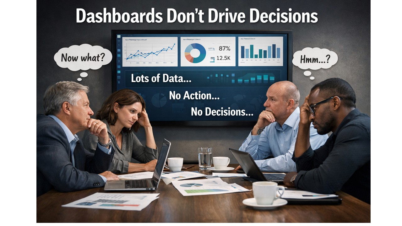
A dashboard goes up on the screen. People nod.
Someone asks a sensible question.
Someone else offers an interpretation.
A third person disagrees.
And then the meeting ends.
- No decision.
- No clear action.
- No change in direction.
The dashboard did its job, technically speaking. It showed the data. The numbers were accurate. The visuals were clear. But nothing happened next.
This is the uncomfortable truth: showing information is not the same as enabling a decision.
Why dashboards feel useful but change very little
Most dashboards are built with good intentions. They’re designed to be comprehensive, neutral, and flexible. They show performance from multiple angles. They let the audience explore and “draw their own conclusions”. That sounds sensible.
In reality, it’s where things break down.
Humans don’t make decisions from charts. They make decisions from understanding. And understanding doesn’t come from being presented with options and hoping meaning will emerge. It comes from context, narrative, and relevance to a specific choice that needs to be made.
When a dashboard presents ten charts of equal importance, it silently asks the audience to do the hardest work themselves:
- What matters most?
- What should I focus on?
- What does this mean for the decision I’m responsible for?
Different people answer those questions differently. That’s why dashboards often create debate rather than direction.
“Interesting” is not a success metric
One of the most dangerous words in analytics is interesting.
If someone looks at a dashboard and says, “That’s interesting,” what they usually mean is:
- I can see patterns
- I’m not sure what they imply
- I don’t yet know what to do
An interesting dashboard might get attention. It might even get praise. But if it leaves the audience thinking “Hmm…” instead of “Here’s what we need to do”, it has failed its most important job.
A successful analytics product doesn’t just inform. It reduces uncertainty at the moment a decision needs to be made.
The missing ingredient: decision intent
The real issue isn’t visualisation. Its intent.
Most dashboards are built by starting with the data:
- What tables do we have?
- What measures can we calculate?
- What breakdowns might be useful?
Decision-driven analytics starts somewhere else entirely:
- What decision is currently blocked?
- Who owns that decision?
- What would change if we had clarity?
When you start with the decision, everything else sharpens:
- Fewer metrics matter.
- Visuals become explanatory, not exploratory.
- The report develops a point of view.
This doesn’t mean manipulating the data or hiding nuance. It means accepting responsibility for guiding the audience, rather than outsourcing interpretation to them.
Why better dashboards aren’t the answer
When organisations realise their dashboards aren’t driving action, the usual response is to build more of them. Or rebuild them. Or redesign them.
But without a shift in thinking, you just end up with nicer dashboards that still don’t lead anywhere.
The constraint is not Power BI. It’s not DAX. It’s not modelling. The constraint is that most teams have never been taught how to design analytics around decisions, rather than around data structures.
From dashboards to decision tools
This is exactly the gap the Data Accelerator is designed to address.
The Accelerator isn’t about teaching people how to build more reports. It’s about changing how analytics work gets framed in the first place:
- starting with real business decisions
- designing reports with a clear beginning, middle, and end
- reducing cognitive load rather than adding visual complexity
- turning Power BI outputs into tools that actually influence behaviour
When teams adopt this approach, something interesting happens.
Meetings change. Conversations move faster. Decisions become clearer.
Not because the data is different, but because the analytics finally lead somewhere.
A simple test for your last dashboard
If you want to pressure-test your own work, try this:
- What decision was it designed to support?
- What action should follow from it?
- Would two different stakeholders reach the same conclusion?
If those answers aren’t obvious, the dashboard isn’t finished yet.
Dashboards don’t drive decisions.
But decision-driven analytics does, when it’s designed that way on purpose.
Next in this series, I’ll dig into why “more data” often makes decision-making worse, and how to design analytics that work with the human brain rather than against it. If you to come and see me talk about this at the Birmingham Power BI User group on 4th March, you can signup here�
News
Berita Teknologi
Berita Olahraga
Sports news
sports
Motivation
football prediction
technology
Berita Technologi
Berita Terkini
Tempat Wisata
News Flash
Football
Gaming
Game News
Gamers
Jasa Artikel
Jasa Backlink
Agen234
Agen234
Agen234
Resep
Cek Ongkir Cargo
Download Film

Why Data Platforms Like Microsoft Fabric Don’t Fix Broken Data Culture
- A new platform.
- A more integrated stack.
- A promise that this time things will be different.
That’s where platforms like Microsoft Fabric come into play.
- Fabric is powerful.
- Modern.
- Well-architected.
But it’s also one of the most misunderstood investments organisations make. Because platforms don’t fail organisations. Organisations fail to change how they work around them.
The platform myth
There’s a comforting belief that goes something like this:
“Once we’re on the right platform, everything will fall into place.”
- Data will be trusted
- Reporting will be faster
- Teams will align
- Decisions will improve
The platform becomes a proxy for leadership, strategy, and culture. That belief is understandable, but it’s wrong.
What platforms are actually good at
Let’s be clear: platforms like Microsoft Fabric are not the problem.
They are exceptionally good at:
- Centralising data
- Standardising tooling
- Reducing architectural sprawl
- Enabling scale and performance
- Supporting modern analytics patterns
Fabric can remove technical friction. What it cannot remove is organisational friction.
Broken data culture looks like this.
Before blaming tools, it’s worth recognising the symptoms of a broken data culture:
- Metrics are debated more than decisions
- Reports exist, but trust is low
- Teams optimise locally, not collectively
- Data ownership is unclear or political
- Leadership asks for insight, but rewards speed over rigour
In these environments, a new platform doesn’t create clarity; it amplifies confusion.
Why platforms don’t fix culture
Here are a few reasons explaining why data platforms don’t fix and organisations’ data culture
1. Platforms don’t define purpose
A data platform can answer:
“Where does the data live?”
It cannot answer:
“Why does this data matter?”
Without a shared understanding of:
- Business priorities
- Critical decisions
- Success measures
Even the best platform becomes an expensive filing cabinet.
2. Platforms don’t align with leadership
Data culture is set at the top of a business or organisation.
If leaders:
- Ask for different numbers in different meetings
- Override data with instinct when it’s inconvenient
- Reward delivery over quality
Then no platform will create trust. Culture is reinforced by behaviour, not architecture.
3. Platforms don’t resolve ownership
Modern platforms centralise data, but they don’t magically assign accountability.
Without clear ownership:
- Data quality issues persist
- Definitions drift
- “Someone else owns that” becomes the default
Fabric can host your data estate. It cannot tell you who is responsible for it.
4. Platforms don’t simplify decision-making
A common failure mode is more capability, less clarity.
With powerful platforms:
- More data becomes accessible
- More metrics get surfaced
- More dashboards get built
But without decision discipline, this leads to:
- Cognitive overload
- Slower meetings
- Analysis paralysis
Better tools don’t automatically mean better decisions.
5. Platforms don’t change incentives
People respond to what they are measured on. If teams are incentivised to:
- Deliver quickly rather than accurately
- Protect their numbers rather than challenge them
- Avoid uncomfortable insights
Then culture won’t shift, regardless of platform.
Technology follows incentives, not the other way around.
When platforms do work
Organisations that succeed with platforms like Microsoft Fabric tend to do a few things differently:
- They establish clarity before migration
- They define decision ownership early
- They align leaders on what “good” looks like
- They treat the platform as an enabler, not a saviour
In these environments, Fabric accelerates progress rather than exposing cracks.
The uncomfortable truth
If dashboards are already struggling…
If trust in data is fragile…
If reporting feels slower every year…
A new platform will not fix those problems. It will surface them faster.
Why this matters
Many organisations invest heavily in platforms expecting transformation. What actually they get instead is:
- Better plumbing
- The same arguments
- New tooling layered on old habits
The gap between capability and impact grows wider. That’s not a platform failure. It’s a leadership and culture challenge.
Where this fits in the bigger picture
This article builds on Why Dashboards Fail and leads into the next questions many leaders face:
- If platforms don’t fix culture, what does?
- How do we know whether we’re observing the right things?
- Why does reporting slow down as complexity grows?
Those are the questions explored in the next parts of this series:
They’re also the questions organisations bring into our Data & Analytics Accelerator often after investing in the platform first.
A better starting question
Instead of asking:
“Is Fabric the right platform for us?”
A more useful question is:
“Are we ready to get value from it?”
That answer has very little to do with technology, and everything to do with clarity, ownership, and culture.
Useful Links
Building a Data-Driven Story: From Reports to Impact
Introduction to the Microsoft Data Platform – Data Platform Roles
What is Microsoft Fabric and How Does It Relate to Power BI?
News
Berita Teknologi
Berita Olahraga
Sports news
sports
Motivation
football prediction
technology
Berita Technologi
Berita Terkini
Tempat Wisata
News Flash
Football
Gaming
Game News
Gamers
Jasa Artikel
Jasa Backlink
Agen234
Agen234
Agen234
Resep
Cek Ongkir Cargo
Download Film