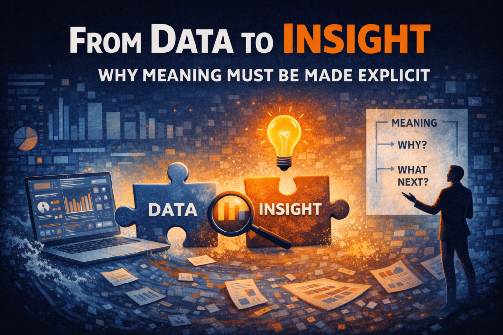
From Data to Insight: Why Meaning Must Be Made Explicit
The invisible gap in most dashboards
Think about the typical BI workflow.
- Collect the data
- Clean the data
- Model the data
- Visualise the data
And then we stop. We assume the insight is now “in there” somewhere, waiting to be absorbed by whoever looks at the report.
But insight doesn’t automatically emerge from a bar chart. What actually happens is this:
- People see patterns
- They interpret those patterns differently
- They fill gaps with assumptions
- They argue about what it means
And suddenly the conversation shifts from decision-making to interpretation.
The data was correct.
The visual was clear.
But the insight never landed.
Insight is not information
This is the key distinction.
Information answers: What is happening?
Insight answers: Why does it matter?
Those are not the same thing.
You can show that churn has increased by 2%. You can show that revenue dipped in Q3. You can show that customer acquisition costs are rising.
None of those are insights on their own. They are observations.
Insight only exists when someone can articulate:
- Why this change matters
- What it implies
- What should happen next
Until that happens, you have information, not insight.
Why this matters more than ever
As we’ve already discussed in this series, we’re not short of data, we’re drowning in it. We are not swimming anymore!
In a high-volume environment, the ability to extract insight becomes more important than the ability to produce visuals.
Because when information increases, ambiguity increases with it, unless someone deliberately reduces it.
If insight isn’t made explicit, people will invent it. And when different people invent different interpretations, you get friction instead of forward motion.
Stories are the bridge
This is where storytelling comes in.
Not storytelling as theatre.
Not storytelling as spin.
Storytelling as structure.
A story connects numbers to the real world. It frames what we’re seeing, highlights what’s important, and explains the implications.
For example:
“Revenue declined by 3%” is information.
“Revenue declined by 3%, primarily driven by a drop in mid-market renewals following the pricing change in June, which puts our annual target at risk unless retention improves” that’s insight.
The second version doesn’t dumb anything down. It makes the meaning explicit.
It removes the need for interpretation for the audience.
This is not about simplifying the data
There’s a common objection at this point:
“Surely people should draw their own conclusions?”
Sometimes, yes. But if your role is decision-support, your responsibility is clarity.
Being intentional about meaning isn’t manipulation. It’s discipline.
It means asking:
- What is the core takeaway here?
- What assumption needs to be removed?
- What decision does this support?
If you don’t answer those questions, the dashboard leaves too much open. And open interpretation in business environments often leads to stalled decisions.
In Power BI, structure matters more than visuals
This is the part that most people underestimate. Insight doesn’t come from choosing the “right” chart type alone.
It comes from:
- structure
- layout
- sequencing
- titles
- annotations
- narrative flow
A Power BI page with five technically perfect visuals can still fail if it doesn’t guide the viewer through a clear story.
- What are we looking at?
- Why does this matter?
- What changed?
- What should we do?
If that flow isn’t obvious, insight isn’t landing.
The cost of leaving meaning implicit
When dashboards leave meaning implicit, three things happen:
- Meetings get longer
- Interpretations fragment
- Decisions slow down
Because the audience is doing analytical work that should have been done before the report was published. That’s not empowerment. That’s inefficiency.
The role of analytics is not to present options endlessly. It is to reduce uncertainty. And reduction requires making meaning explicit.
The shift we work on inside the Data Accelerator
Inside the Data Accelerator, one of the core exercises we run is simple:
Take a dashboard and force the team to write, in plain language:
- What is the key insight?
- Why does it matter?
- What is the implication?
If that statement is difficult to produce, the dashboard isn’t finished.
We don’t start by changing visuals.
We start by clarifying the meaning.
Because insight isn’t something the viewer extracts.
It’s something the analyst must articulate.
A simple test
Look at one of your key charts and ask:
If I removed the title and labels, could two different stakeholders interpret this differently?
If the answer is yes, then the insight hasn’t been made explicit.
Data is raw material. Visuals are presentation. Insight is interpretation. And interpretation doesn’t happen by accident.
In the next post, we’ll explore how structure, beginning, middle, and end, turns isolated insights into decision-ready stories.
From the series: Dashboards Don’t Drive Decisions (And That’s the Real Analytics Problem)
News
Berita Teknologi
Berita Olahraga
Sports news
sports
Motivation
football prediction
technology
Berita Technologi
Berita Terkini
Tempat Wisata
News Flash
Football
Gaming
Game News
Gamers
Jasa Artikel
Jasa Backlink
Agen234
Agen234
Agen234
Resep
Cek Ongkir Cargo
Download Film

Data, Charts, and Insight: Why Seeing the Numbers Isn’t Enough
The dangerous assumption at the heart of analytics
There’s a deeply ingrained belief in analytics that goes largely unchallenged:
If we collect the right data and visualise it clearly enough, insight will emerge on its own.
It sounds reasonable. It’s also wrong.
Data plus charts does not equal insight. What it usually equals is more to look at.
When organisations struggle to make decisions, the response is often to add more dashboards, more visuals, more breakdowns. The hope is that clarity will eventually appear if we just keep refining the charts. But insight doesn’t magically appear when you put numbers into a bar chart.
What actually happens instead
What usually happens is cognitive overload. People look at a dashboard and they do see patterns:
- trends going up or down
- outliers that look worrying
- comparisons that seem interesting
But they don’t know:
- which patterns matter
- what’s driving them
- whether they’re signals or noise
So the brain does what it always does when meaning isn’t explicit, it fills the gaps.
Different people bring different assumptions, experiences, and incentives into the room. The same chart produces multiple interpretations. And suddenly the conversation isn’t about action anymore. It’s about debate.
Why “correct” charts still lead to bad outcomes
This is the part that frustrates analysts the most.
- The charts are technically correct.
- The measures are accurate.
- The data model is sound.
And yet… nothing happens.
That’s because correctness is not the same as usefulness. A chart can be accurate and still be ambiguous. It can show a trend without explaining its cause. It can highlight a change without indicating whether it’s good, bad, or expected.
When insight isn’t explicit, analytics quietly shifts responsibility onto the audience:
- You decide what this means
- You decide what matters
- You decide what to do next
That might feel neutral, but it’s actually abdication.
The insight gap no one talks about
There’s a gap in most analytics workflows that rarely gets named.
We go from:
- data collection
- to modelling
- to visualisation
And then we stop.
We assume insight lives somewhere inside the charts, waiting to be discovered by the viewer.
In reality, insight only exists when someone makes meaning explicit:
- This matters because…
- This is happening due to…
- This means we should…
Without that step, dashboards become pattern libraries rather than decision tools.
Why conversations end with questions, not conclusions
If analytics conversations in your organisation tend to end with:
- “We need to dig into this further”
- “Let’s take this away”
- “Can we get a breakdown by…?”
That’s not curiosity. It’s uncertainty. Those questions aren’t a sign of engagement, they’re a sign that the report didn’t do enough thinking on behalf of the audience.
Exploration has its place. But when every dashboard invites exploration, and none of them land a conclusion, decision-making slows down dramatically.
This is how you end up with organisations that are “data-driven” in theory, but instinct-driven in practice.
Insight requires intent, not just visuals
The missing ingredient isn’t a better chart type. It’s intent.
Insight only appears when analytics is designed to answer a specific question for a specific decision-maker at a specific moment.
That means:
- deciding what the chart is for, not just what it shows
- choosing what to exclude as deliberately as what to include
- making the implication clear, even if it feels uncomfortable
This doesn’t mean removing nuance or hiding uncertainty. It means guiding interpretation instead of leaving it to chance.
Why does this keep happening
So why do organisations keep falling into this trap? Because most analytics teams are rewarded for:
- accuracy
- completeness
- technical sophistication
They are rarely rewarded for:
- clarity
- decisiveness
- influence on outcomes
As a result, dashboards optimise for being right rather than being useful.
Until that changes, we’ll keep producing analytics that looks impressive but struggles to change behaviour.
From charts to insight: the shift we work on in the Accelerator
This distinction, between data, charts, and insight, is one of the foundations of the Data Accelerator.
The Accelerator exists to help teams:
- Stop assuming insight will emerge on its own
- Design analytics around explicit decisions
- Reduce cognitive overload instead of adding to it
- Turn Power BI outputs into a shared understanding, not competing interpretations
When teams make this shift, the quality of conversations changes. Fewer questions are asked at the end of meetings — not because curiosity disappears, but because clarity increases.
A simple test for your dashboards
Here’s a quick way to spot the problem. Look at a chart and ask:
- What conclusion should everyone reach?
- What assumption does this remove?
- What decision does this support?
If those answers aren’t obvious, the chart isn’t finished yet.
Data is not insight. Charts are not understanding.
And until we stop treating them as interchangeable, dashboards will continue to fail at the one thing we expect them to do: help us decide.
In the next post, I’ll look at how data overload makes this problem worse, and why more dashboards often lead to less clarity, not more.
Read the previous post: Dashboards Don’t Drive Decisions (And That’s the Real Analytics Problem)
News
Berita Teknologi
Berita Olahraga
Sports news
sports
Motivation
football prediction
technology
Berita Technologi
Berita Terkini
Tempat Wisata
News Flash
Football
Gaming
Game News
Gamers
Jasa Artikel
Jasa Backlink
Agen234
Agen234
Agen234
Resep
Cek Ongkir Cargo
Download Film